INTRODUCTION
Since growing up I've always been fascinated by any form of media, usually it's something through a slick of glass or some kind of sonic sound, regardless of what it is it's also somehow seemed into what i present as artwork today.
For me it was easy to just use Video games as the basis of this Artwork, the problem i faced was on how to go about doing that, having little to no knowledge on how to actually code anything i had to scrummage the internet for ways around this, i came across some popular software titled; Stencyl.
Stencyl introduces a flexible interface that allows you to drag and drop snippets of code through a more visual aspect and also allows you to see behind the GUI and manually make tweaks to said variables.
I started off with a "
Crash Course Tutorial"
The first was a basic how to make a 2D Platformer.
the 2nd was a how to make an asteroids clone
these two tutorials were my introduction to the ground work from then on the rest was just trial and error, playing with variables and figuring out how certain things react.
Stencyl tutorial link
 |
| Basic variables for a walking function |
 |
| Asteroids clone |
So with the whole learn as i go principal in place I started doing the stuff i'm most familiar with. Visuals.
ENVIRONMENTS
 |
| Some random textures |
All i knew is i wanted to make a 2d side scroller type game, so i started by painting some random textures.
 |
| The first iteration |
The fist area i actually imagined almost like endless pile of wasted artwork, with a character that ventures flying through on the back of some kind of animal much inspired by The Neverending Story, but i didn't feel comfortable working with a light toned more minimal art style so gradually i adapted it to a more melancholic feeling atmosphere.
 |
| Redesigned |
 |
| Final Concept for first area |
So now having a somewhat idea on the art direction i began to enlarge the canvas size placing more areas, building composition and trying to have everything feel somewhat natural and organic instead of feeling somewhat out of place or being there just for the sake of.
the first part became the crossroad between the junk/industrial area and the overgrown forestry type area, basically it's a mini hub world from there every other level or zone would be accessed.
 |
| The Legend Of Zelda : Wind Waker |
The second part of the map to be developed was the temple area, this area was inspired by game called The Legend Of Zelda, i wanted to create some glowing orbs, to kind of show case a little bit more knowledge with a Stencyl, at first i created a mock up through Photoshop
 |
First Concept
|
Result
Mock-up
then i went on to creating multiple sprites/actors (in Stencyl terms) that would spawn at random times, in random locations and then fade out.
now to create some kind of sassy contrast i started working on the opposite side, JUNK! heaps and heaps of junk.
the first thing that sprung to my mind was sheets of iron so i started with an old rusty building
(Concept of early building)
 |
| First Concept |
More Detail
Junk + Background
Second Building
I then started to expand it out, to create some kind of landscape i filled it up with junk, using strong square like shapes instead of curves or rounded edges it slowly developed
 |
| Junk Yard |
 |
| Overall Shot |
DEM THINGS DAT GOT CUT
now i should mention, there was more areas i had been working on.
one was a small
pond of water just shire of the temple.
 |
| Pond |
Another was the temple interior.
 |
| Temple Interior |
 |
| Mushroom |
 |
| Temple Interior |
And finally one inspired by my class room.
 |
| Le Class |
THE HERO?!
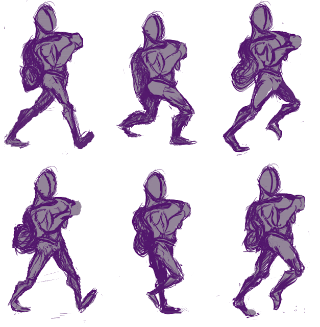
The other grueling process of this was creating a character and animating him.
he probably went through a much larger process than the environments, the early concepts were more about grasping a walk cycle than anything else, as there is always the learning curve of walk cycles etc. initially this was the first version.
Then gradually he evolved ...


SOUND!
https://soundcloud.com/scott-wallis-4/dasdasd
https://soundcloud.com/scott-wallis-4/mike-teavee
https://soundcloud.com/scott-wallis-4/tick-tock
The initial track was recorded through a desktop mic, the next two were recorded with better hardware.
Tick-Tock was the final result, it has a more fitting atmosphere, i still would have like to have fleshed it out but i just left it as is, all of these were a combination of acoustic guitar, electric guitar, vocals and 8 bit audio samples.
The end result of this project was an enjoyable and heavy as a learning experience, interactive mediums is still a pretty up and coming thing and it's a field i plan on exploring further.


