Saturday, 4 July 2015

"HUATOKI"

INTRODUCTION

A project i have somewhat struggled with, having so many ideas and investing so much time, the end result is a hike back to the first idea.

one that was inspired by the happenings from a film project based on the events of the
GET-UP festival, a event that is a collective of mural based works from graffiti artists from all over the country that's held in New Plymouth once a year.

it was the events that happened within this that ended up being the striding continuing of this work, which what i thought would be a pretty relaxed normal day turned into a very windy very wet project, it was under the bridge that i really seen just how passionate these artists are, fighting against the high tide, the gusts of wind and forceful rain.

knocking these artists over, equipment being taken by the river, photographers fearing for their equipment, it was really something remarkable, something that stuck with me throughout the year, running with this idea, it was somewhat inspiration i found that all i needed was a fun way of incorporating this into a project, so i went with something related to some other things that inspire me, more specifically the artists who i feel are underrated the ones who would create Boxart for the videogame industry.
As a kid i was always suckered into buying crappy games just by how the artwork on the front cover looked, the artwork always looked amazing but often when you would play the game it would never actually be anything like that, i was often more interested in having a collection of beautiful box art than playing the games so with that i decided to have a go at recreating something along those lines.
Taking inspiration from the console i was raised around the Nintendo Entertainment System i based the designs on some of the classic games i can fondly remember the difference though is that i was to be working with digital media and not with any traditional  air spray methods, so i had to be careful with certain techniques as it would come across as appearing far too modern and digital this lead me to having the final result looking quite aged and worn, loss of color.

As you can see here, it wasn't exactly the best place to be working.


REFERENCE


Super Metroid cover art. Retrieved from http://metroid.retropixel.net/games/metroid3/


Castlevania cover art. Retrieved from http://castlevaniadungeon.net/forums/index.php?topic=6835.0

After searching through some classic artwork i found these two to be quite interesting in design and technique, and ended up being my main inspiration to capture the atmosphere of Metroid and using design elements of Castlevania (the lines breaking up the imagery and having elements come outside the frame)  


CONCEPTS


This character (who is non gender specific) is representative of the Artists under the bridge, i have given the character a shield made of spray cans to help bring some correlation between  this character and the GET-UP festival, intergrated boots with wings to help with the connectivity of the whole Videogame aesthetic. 

The original box i was working with was going to be based off the Super Nintendo era, i decided against that and to go with a much older NES (Nintendo Entertainment System) box art instead, i used the Airbrush tool over the line work to try and help bring some authenticity from the 80s  and then used the Nintendo seal of approval logo and redesigned my own Rusty Motion logo to a more 80s esque feeling. 

Here, i decided to use my extra time to create another character who i am still out of all honesty not that fond of, at least as far as the final product goes.
The idea for he was that many video games of that bygone era always had a damsel in distress and i felt that it might help build on the atmosphere, i integrated water elements to help give her some kind of sorcery.

PIXEL ART


here is where i decided to create some levels that somewhat represented under the bridge but i wanted it to be far more interesting, so i added things like a chest for items and a tree for a goal and focal point.
I went though a few revisions trying to make the contrasts work as the water was far too busy in the beginning so it ended up being a struggle of balancing detail with lack of, the each part of these screenshots were created as separate sprite tiles and then reassembled into one final piece .

To stick with the authenticity of the design and era, i felt i should create a series of sprites, each created in true pixel by pixel fashion.

This design is supposed to be representative of the Eels and the river itself, i wanted to make it more interesting so i made him hunch and had watery elements dripping to create the illusion of a staff, this way he comes across as a much older being (like the Eels) who is in power.


END RESULT


I felt that i have somewhat achieved a satisfying result, i still feel there are some changes i would like to have made but i certainly had enjoyed this project and i'm glad after all the struggles i finally had something to show, i have been though numerous redesigns and process thoughts i wasn't sure on if i would even finish this project but i'm glad i stuck to it, this has influenced me to venture into the path that i have been fearing for a long time.


Sunday, 3 May 2015

My Process as far.

The focus of my project is representing water in the sense of its historic significance in some way.
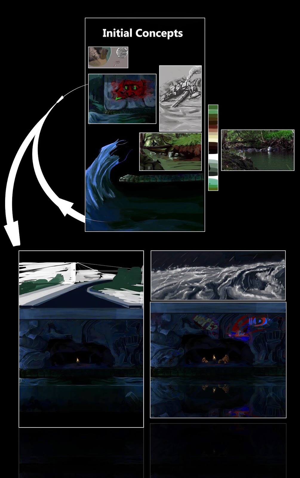
I began by using a river that’s close to me the Huatoki River, and started thinking about ideas in what I feel strongly represents it the first ideas that came to mind was from an event that had recently happened in New Plymouth; The Get-Up festival an event in which a bunch of local graffiti artists come together and create artworks in the sense of street murals at the Hutatoki Plaza, Under the Huatoki bridge and some among other areas.
Many of those days were quite wet and windy, one of those days I happened to be filming the artists under the Huatoki Bridge where the river was flowing strong and the artists were battling against the wind and current, I found that to be very empowering and inspirational.
on the final day the Get-Up festival had band play, one of the members (a bit intoxicated) decided to hop into the stream and try and interact with the eel’s that live amongst the water it drew quite a crowd.  I feel that the Eel is quite an importance to the Huatoki River as it’s something that draws quite a crowd and often many conversations.
To me It’s something that somewhat represents the flow of the river and the river itself.

The few concepts that I am about to show go into these details.
I began by thinking of an animation one that drew inspiration from under the Huatoki bridge; I created a quick mock-up test, the idea was to have a very painterly look that represented strong gusts with fast rapid moving waves. I would then go on to paint each wave.
it didn't take long before i decided to go against that, as I wanted to focus more on a narrative that has strong visual details rather than an animation which would be within motion.


i began looking into more of the history of the Huatoki river and discovered an article talking about a large flood that happened in 1971, with water rises sometimes up to the height of parking meters it left quite an impact on New Plymouth and the sounding areas. from this i began to implement more elements, telling a story with the top panel being a flood, the 2nd panel being under the bridge and the third being below which would have a giant Eel within the Huatoki stream. after a few weeks working on this i lost my perspective of it, it became muddled within nonsensical elements. i certainly wasn't enjoying the direction so once more i left it and started something new. 
the next experiment lead me to researching the word Huatoki... i was curious what does it mean? after a bit of searching i came across an article " The Maori word "Huatoki" can be translated in a number of ways. Some suggest that a literal translation of "many or plentiful adzes" could refer to the availability of suitable stones for adzes in the stream. Alternatively others suggest it is a corruption of Hua Ttoki referring to the many Titoki trees that are abundant in the valley." 

 i took this and began working on a new piece once more attempting to change the format i decided to record the process of creating the artwork, the artwork was to integrate an Eel, the Titoki Trees and the many stones that surround the stream to bring familiarity to the spectators, this is as far as i have come in the process. once more, i have decided to again begin a new piece abet more structured and thought out as far as the visuals go, a more structured streamlined piece in the sense that every element will have a reasoning for it's placement. 

Tuesday, 9 December 2014

My business card design

Inspiration.


Van Gogh
Subconsciously i feel he has always had an influence of my artwork, the way he would apply color in otherwise what would be a world full of flat paintings, with his raw precise but aggressive form of brush strokes and the journey that he went though among an impressionist filled world where people would gasp at the thought of a "peon" being featured within a painting.
Driven along the road of madness from painting a more realistic based work to something that he truly felt expressed his view on color and light i find my self constantly falling back on his astounding body of work for my own study on theory and knowledge.


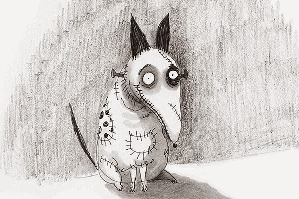
Growing up within a family of 8, i would spend most of my time outside or when everybody's asleep in-front of a television. often gravitating towards old shows like the early original MGM programming, with it's distorted low-fi sound, beautiful black and white tones or the Vibrant off color sepia palettes it's something that felt so magical yet was so imperfect. an experience i would never forget, and through that attraction i later gravitated towards my first hero which was the man behind the creation of characters such as Beetle Juice, Edward scissor hands among others.
Films based around these strange characters that were outcasts within these bright suburban worlds with a strange deathly undertone.

Tim Burton, was someone who  has had a fascinating life, a scholarship into Art school, then leaving to pursue animation and leaving that to pursue the role of a film director.
His artwork would have to be one of my biggest inspirations and my main one up until just about a year ago.


and now we have "Android Jones" he has had more of a commercial influence on me, it's a way of being commercial but without feeling like you're selling your self out. he incorporates multiple design elements into his work with a sound understanding of the relationship of color and composition he builds beautiful pieces of artwork that often have experimental elements and are created through solar powered means and often builds them around environmentally friendly situations.